Sister City
Summer 2020

Background
Sister City is a real estate design, development and consulting firm based in Portland, OR. They specialize in "placemaking that creatively compliments the community and its needs.
Every Sister City project reevaluates standard development practice to emphasize a just balance of equity—social, environmental, and financial." (sister-city.net)

The Logo
As Sister City's founder Anna Mackay began making plans to start her own company, she knew she wanted a logo that felt radically different that that of any of its competitors. A look that would be the complete antithesis of generic, stuffy, and corporate.
Anna had a very clear vision for her logo, and an existing self drawn wordmark she wanted used as the basis of the final version. That's where I came in to redraw and refine, while still maintaining the exciting irregularities and heart of the original.

The Brand
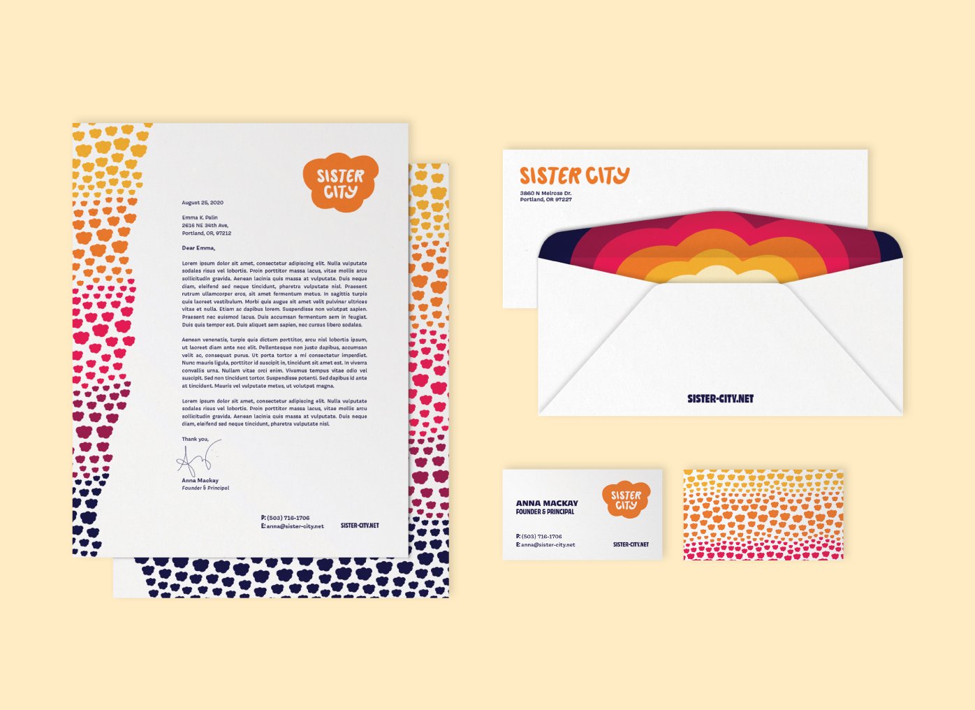
I further expanded on Anna’s aesthetic vision with a full identity system, including a hand drawn cloud icon/holding shape, as well as a pattern using that same cloud. (representing Sister City's roots in beautiful, rainy Portland).
The brand’s color palette and fonts do not shy away from boldness. I went for colors that could be layered harmoniously on top of each other for a retro duotone look, or pop on white backgrounds.


