Inkwell Branding
Summer 2021
AGENCY: MADISON AVE. COLLECTIVE

Background
Open since 1964, Inkwell is a furniture and decor store located in Corvallis, OR. Inkwell began as a commercial stationers and bookstore (hence their name). Through the years, as Inkwell's target audience and offerings shifted, they maintained a commitment to providing goods that are well made and beautifully designed.
Inkwell’s existing brand however (old logo shown bellow), didn’t match the atmosphere of their space or the items they carry. They needed a new look and feel more in line with their product and reputation. The rebrand also served to increase usability across varied applications.

The Logo
Though the name "Inkwell" no longer represents the primary focus of the company, within the Corvallis community it's instantly recognizable and well known. A decision was made to keep the name (but drop the word "The").
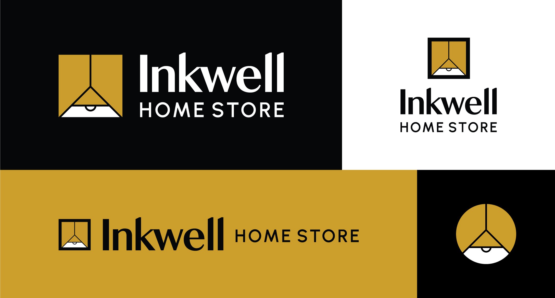
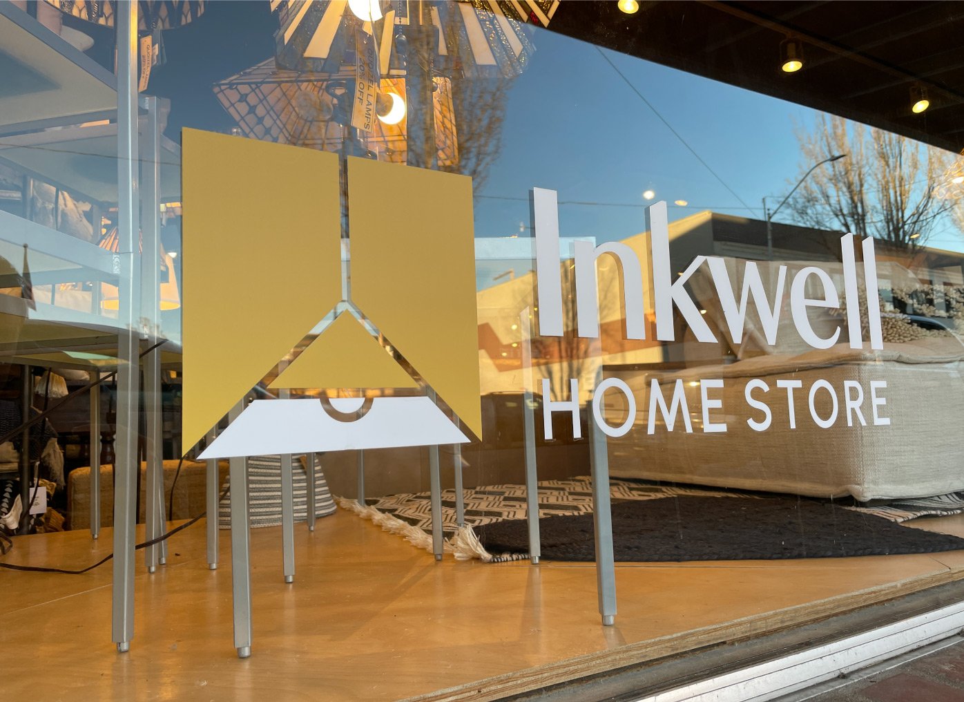
Because of their name it became important to create an icon that indicates the type of store that Inkwell is. And so, after exploring the many different ways we could achieve that, the pendant lamp icon was born.

The Brand
In addition to selecting brand fonts and colors, I designed a custom set of patterns and shapes using elements of the logo icon that can be used to create more compelling compositions.
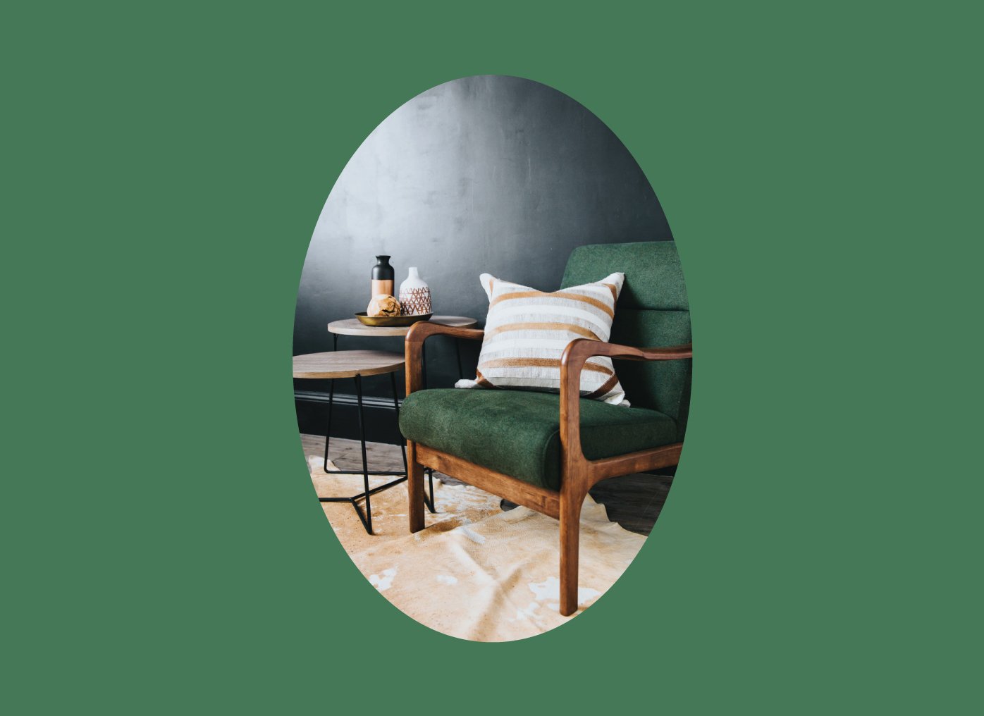
Patterns can be layered behind photos or as a border element. The shape kit is used to create frames for photos and text.


